


Demand for Owner-Occupied Housing in the Time of High Mortgage Rates

Thinking back to introductory economics, you’ll probably remember a figure that looks something like the one below. This is a demand curve, and is meant to capture the natural tradeoff between prices and quantities observed in most markets. Consider tickets for a USC football game. If a decent seat could be had for $50, lots of people would attend the game. However, if the same ticket costs $500, only the most diehard fans of Trojan football would be interested. This inverse relationship is often represented by a downward-sloping line or curve, as shown in red above. Although almost all demand curves slope down and to the right, some are flatter or steeper than others.[1]
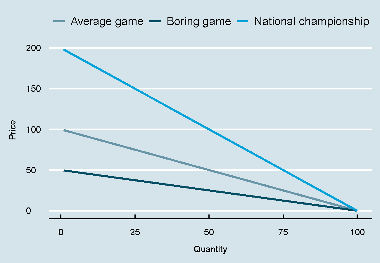
One important factor is substitutability, or the alternatives a potential customer has. Staying with the USC football example, let’s consider two games: a national championship game against Alabama, and a comparatively boring, early August match against Fresno State. Notice how steep the demand curve becomes for the national championship game. After all, since facing the Crimson Tide in a winner-take-all game doesn’t happen very often, tickets can get very pricey (big movements on the y axis), and still attract thousands of boisterous fans to Memorial Coliseum (not much movement on the x axis). In contrast, the game with Fresno State won’t attract nearly the same attention, and would-be fans might choose instead to go surfing, golf, or just watch it on TV. The punchline: lots of alternatives imply flat demand curves, whereas customers will bite the bullet to attend “the only game in town.”
Another important factor determining the steepness of demand curves is price itself, particularly as it relates to the overall budget. When was the last time you looked at the price of matches, Chapstick, or paper towels? Although it might be irritating to pay $4 for lip balm at the airport, the irritation of cracked lips is worse, especially given the trivial cost. However, most customers would balk at spending $10,000 on a Viking range compared to a $1,000 Whirlpool model.
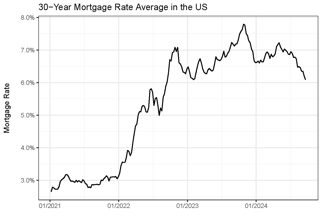
As it turns out, the same considerations help us make sense of the current real estate market. A reader of this article will know that interest rates took off in mid-2021, more than doubling from sub-3% to over 7% in 15 months (see below). Anyone trying to buy a house in mid-2023 faced a rude awakening, with the monthly cost of a $800,000 mortgage soaring almost 60%, from $3,372 to $5,322.
A natural question is whether a higher cost of credit translates to lower demand for houses and, critically, whether this varies across cities. Whereas all cities should experience a drop in demand with higher interest rates, the effect should be strongest where–like appliances compared to matches–housing costs represent a larger percentage of household budgets.
To take a closer look, we partnered with MacroX, a startup that produces uniquely detailed real-time series on macroeconomics and local economic trends.[2]
We use city-level indices of demand for owner-occupied housing based on transactions, online searches for listings, and other variables. These indices are a fantastic resource since we typically cannot observe housing demand by itself but instead must rely on prices or transactions, which are also impacted by supply.
For each metro area, we measure the percentage change in demand for houses from June 2021 to June 2023, a period that corresponds with the sharp increase in mortgage rates shown above. Then, we plot these differences in demand–all cities featured drops–against housing affordability measures. In places where housing is more expensive relative to income, we expect the impact of higher interest rates to be larger than in more affordable cities. This is because, in more expensive cities, there should be fewer potential home buyers.
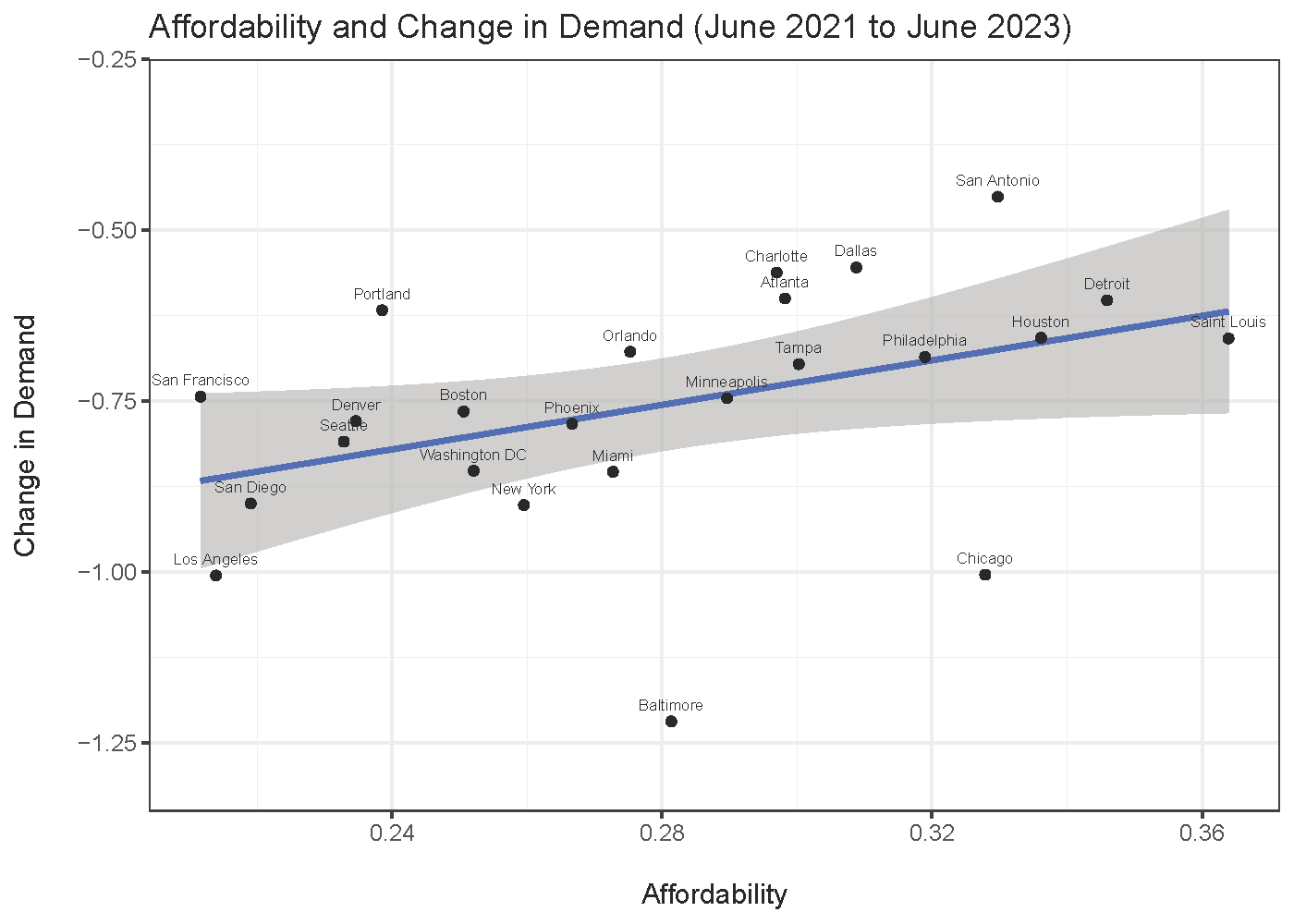
The figure above suggests that this intuition is born out in the data. On the left-hand side of the picture, we see that the most expensive cities (relative to income) are West Coast hubs such as Seattle, San Francisco, San Diego, and Los Angeles. In these cases, demand plummeted the most as rates soared, as we would expect given that the typical buyer is maximally stretched. On the right side, more affordable cities such as San Antonio, Detroit, and St. Louis also saw buyers pull back, but much less so on a percentage basis. This makes sense, given that the median home price in St. Louis is about $235,000, less than half the national average. While an increase in monthly mortgage costs of $600 is certainly not trivial, this is not catastrophic to many households, who can still afford to buy.
Going forward, if rates were to drop, we would expect the relation above to reverse. For the same reason that increases in mortgage rates eliminated many would-be house purchasers in expensive cities, dropping rates should bring these potential buyers back into the market. This would lead to a downward-sloping line, and all else equal, it would predict the largest price increases in cities that are already expensive.
[1] In economic parlance, this phenomenon is referred to as price elasticity of demand. More price elasticity corresponds to a flatter line/curve, whereas less price elasticity (or “inelasticity”) implies a steeper slope.
[2] Their aggregate housing demand and supply indices have been used to predict broader fluctuations in US house prices: https://www.linkedin.com/posts/apurvj1_alternativedata-ai-macroeconomics-activity-7164072378501713921-mGTb/?utm_source=share&utm_medium=member_desktop